
This articles sums up some of the most common visualizations in Microsoft Power BI Desktop. (Remember that you create reports in BI Desktop and then publish them to powerbi.com.)
(This article is part of our Power BI Guide. Use the right-hand menu to navigate.)
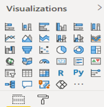
Power BI standard visualizations
Power BI has the normal set of visuals in the default product. The palette of standard visualizations looks like this:
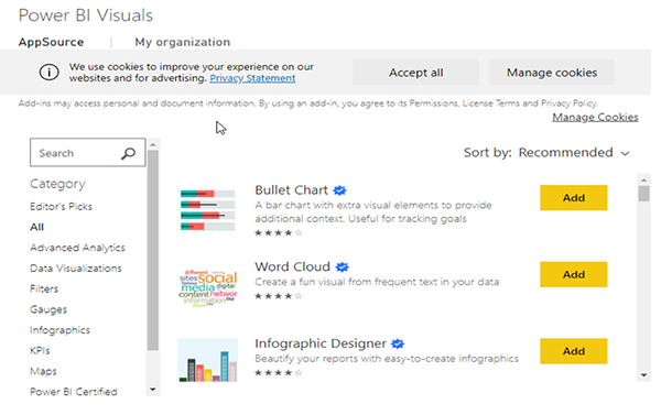
But the product is made better by third-party visualizations, where anyone can contribute a new or variant visualization to a central repository.
Power BI visuals
Here are some of the other Power BI Visuals:
Pie chart
The icons from the visualization palette are too small to copy here. Fortunately, the pie chart looks like a pie. Hover the mouse over the palette and the name fill pops up.
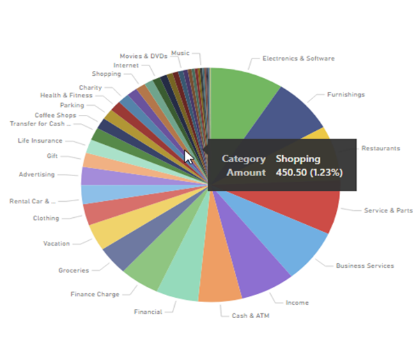
Like the histogram, the pie chart divides the data set into slices that together sum to 100%.
This example is expenses by category. The percentage and amount would make the chart too crowded if they were all added there. So that is done using tooltips, which are popups to show additional information.
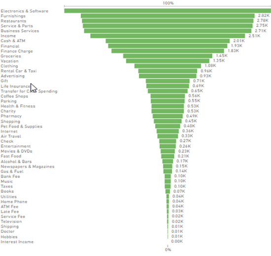
Funnel
Here is the funnel. It also sums to 100%. This shows spending by category in descending order.
Stacked bar chart
A bar chart gives two dimensions, meaning one metric on the x axis and one on the y axis. To add another metric, you can use the actual bar itself to convey information.
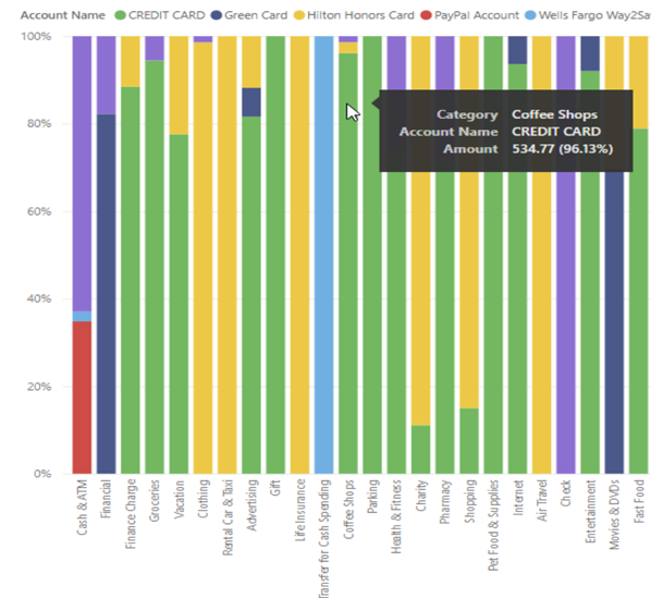
In this stacked bar chart, we not only have spending by category, we have it by account. The vertical lines are scaled so that the first column represents one amount, while the second shows a different amount. That lets each line be the same height.
In the funnel and pie chart we had to drop categories as they were much larger than the other, thus squashing most categories that were too small to read.
Related reading
- BMC Machine Learning & Big Data Blog
- Data Visualization Guide, a series of tutorials on various products
- Tableau Online Guide
- Data Storage Explained: Data Lake vs Warehouse vs Database